Our digital product

How do we create zone- or (much better) grid specific VRA maps from yield data?
- We transform the raw yield data collected by the harvester into geospatial data ready for further analysis and clean it.
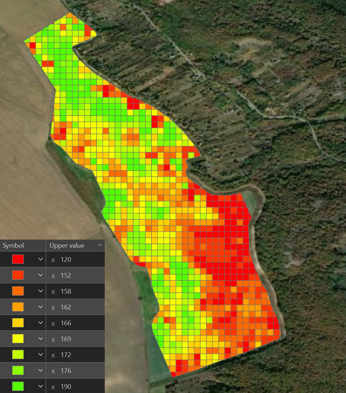
- We create for each field a 10*10m or 33×33 ft grid net which is the base for any further calculations and in ideal case for the VRA maps also.
- From the cleaned data, if needed we create management zones, taking into account elevation, soil variations, remote sensing data, and other site-specific characteristics.
- After consulting with the farmer, we dose the grids or zones according to the treatments and upload the final map to the equipment’s monitor or we send it via cloud.
- We measure the applications afterwards if needed, so the results of the treatments can be seen.
- After harvest, we further optimise our maps based on the latest yield data and earlier treatments. This method leads to the full-scale full personalized economic optimization.
Our workflow in a nutshell
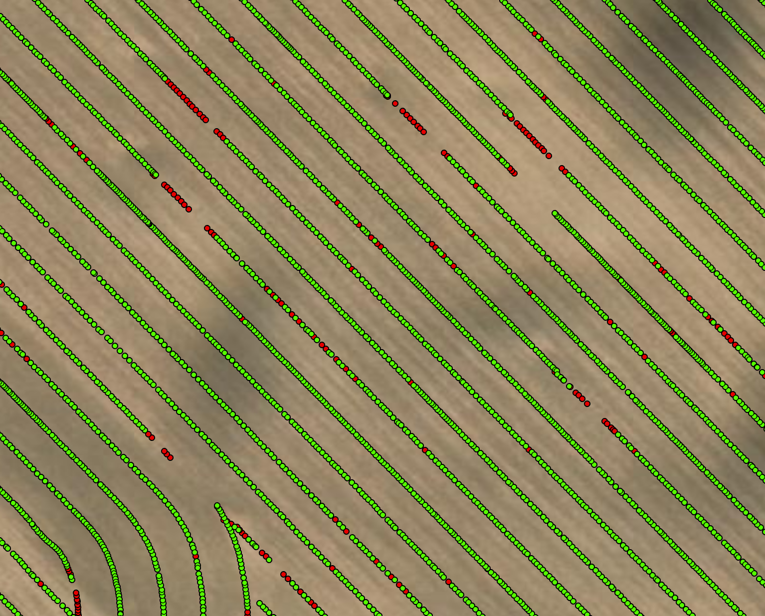
The raw data contains errors that need to be corrected.
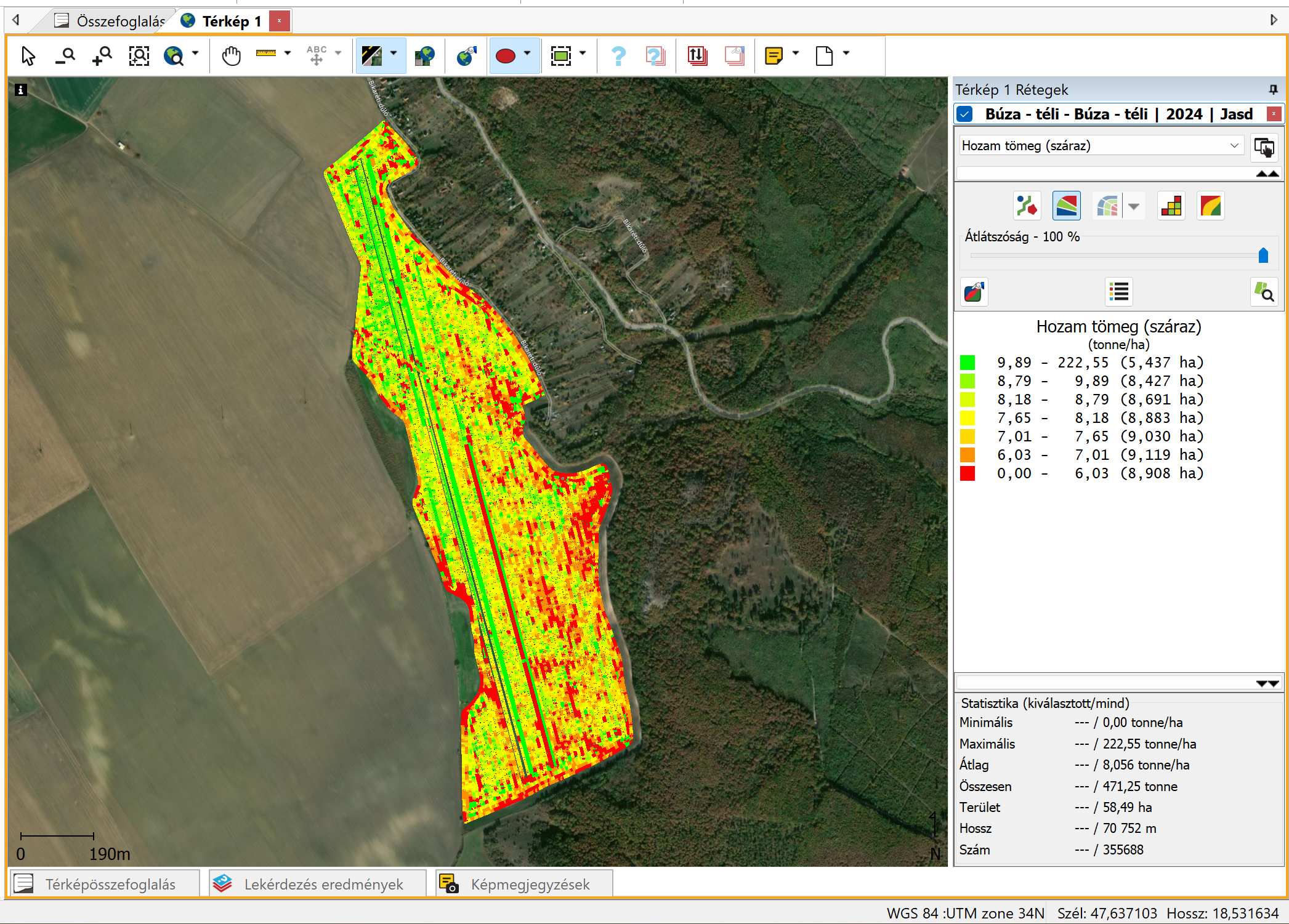
Below is the raw yield map of winter wheat field from 2024, imported into Ag Leader SMS software.
The false yield fluctuations due to terrain elevation and other reasons are not even visible. But here you can see that the raw maximum yield (222,55 t/ha or 3309,35 bu/ac) is a critical and totally incorrect data error.
Only the few percent of the total yield is so highly incorrect, what would be leading incorrect VRA maps.
By removing unrealistic and outlier values and validating uncalibrated data, we clean the dataset. During this process duplicate rows, and incorrect values are eliminated.
Raw vs. the cleaned data
Exported from Ag Leader SMS as a shape file after processed and visualised in ArcGIS Pro.
Distribution of elevations above sea level
This 57ha or 140 acre field shows large differences in elevation. The difference between the highest and lowest points is 56m or 184 feet. In this particular field, even a 1% change in elevation (which you might not see with the naked eye) can cause a 3% decrease in yield. This shows a strong relationship between yield and the slope of the land.
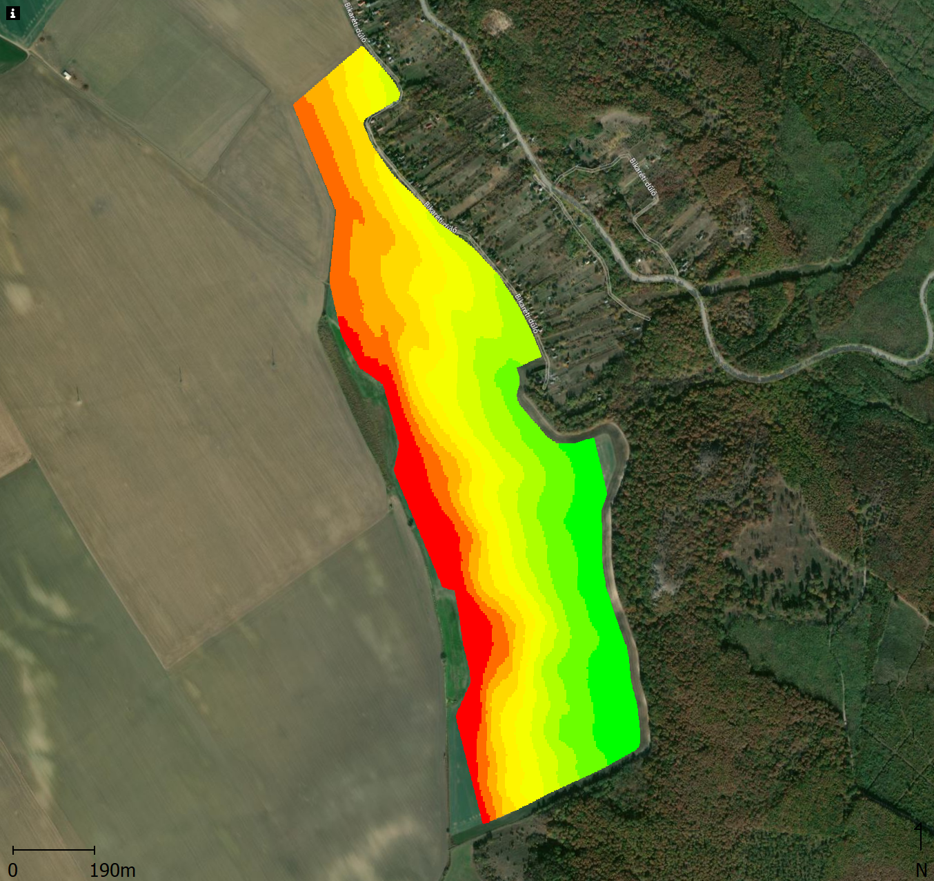
Yield data variation for management zone delineation
2021 – winter wheat

2023 – winter wheat
2024 – winter wheat
The images show that every year is different. This is why we use yield data from as many years as possible. The most important rule is that we only average data from the same type of crop. For example, mixing the yields from corn and winter wheat will lead to serious errors. This is because these two crops have very different spatial yield distributions.
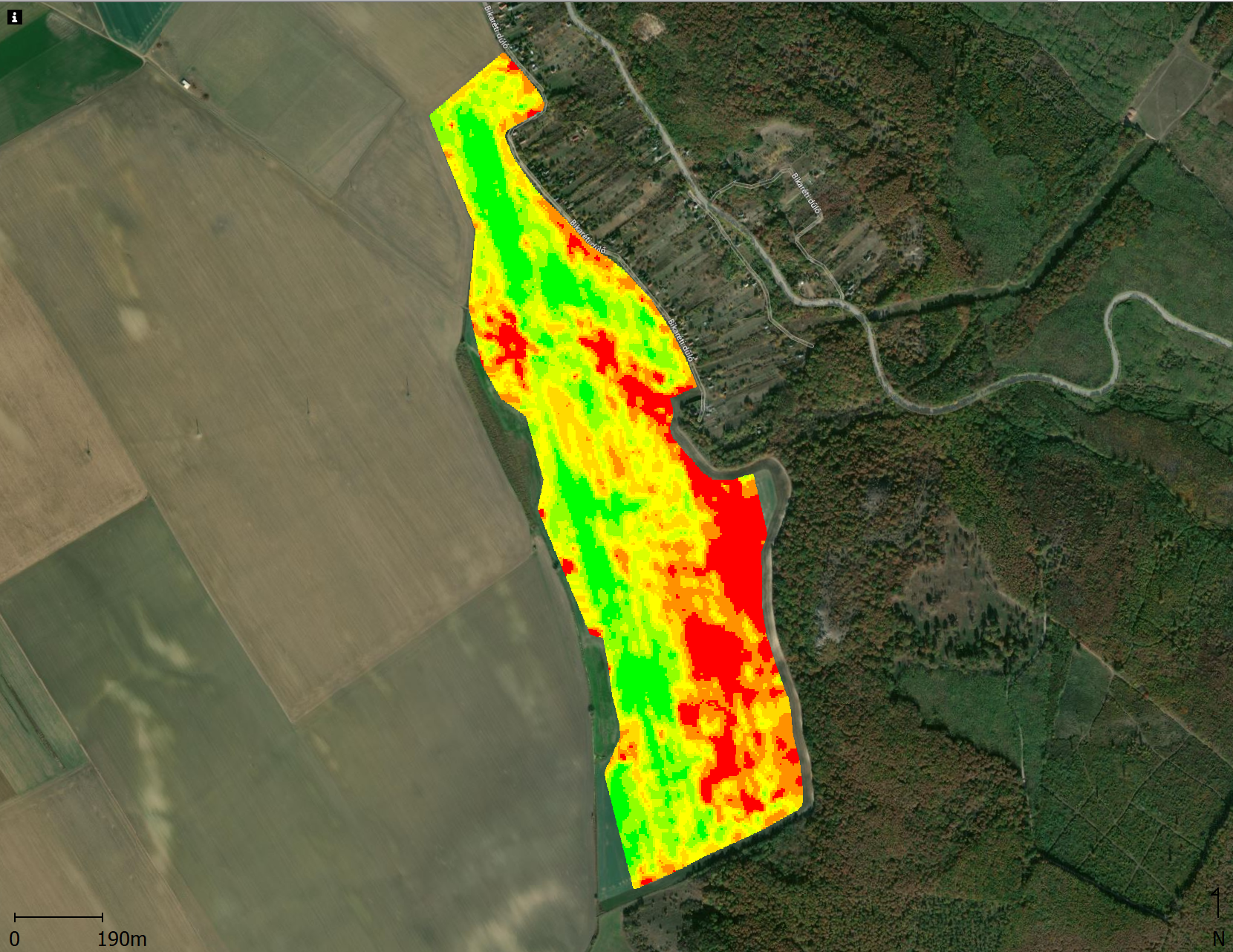
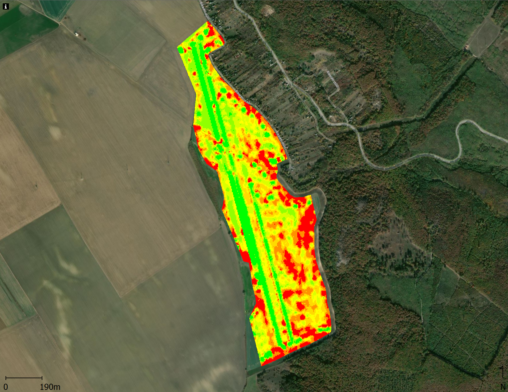
How different NDVI values affect the yield and the creation of zones within a vegetation period
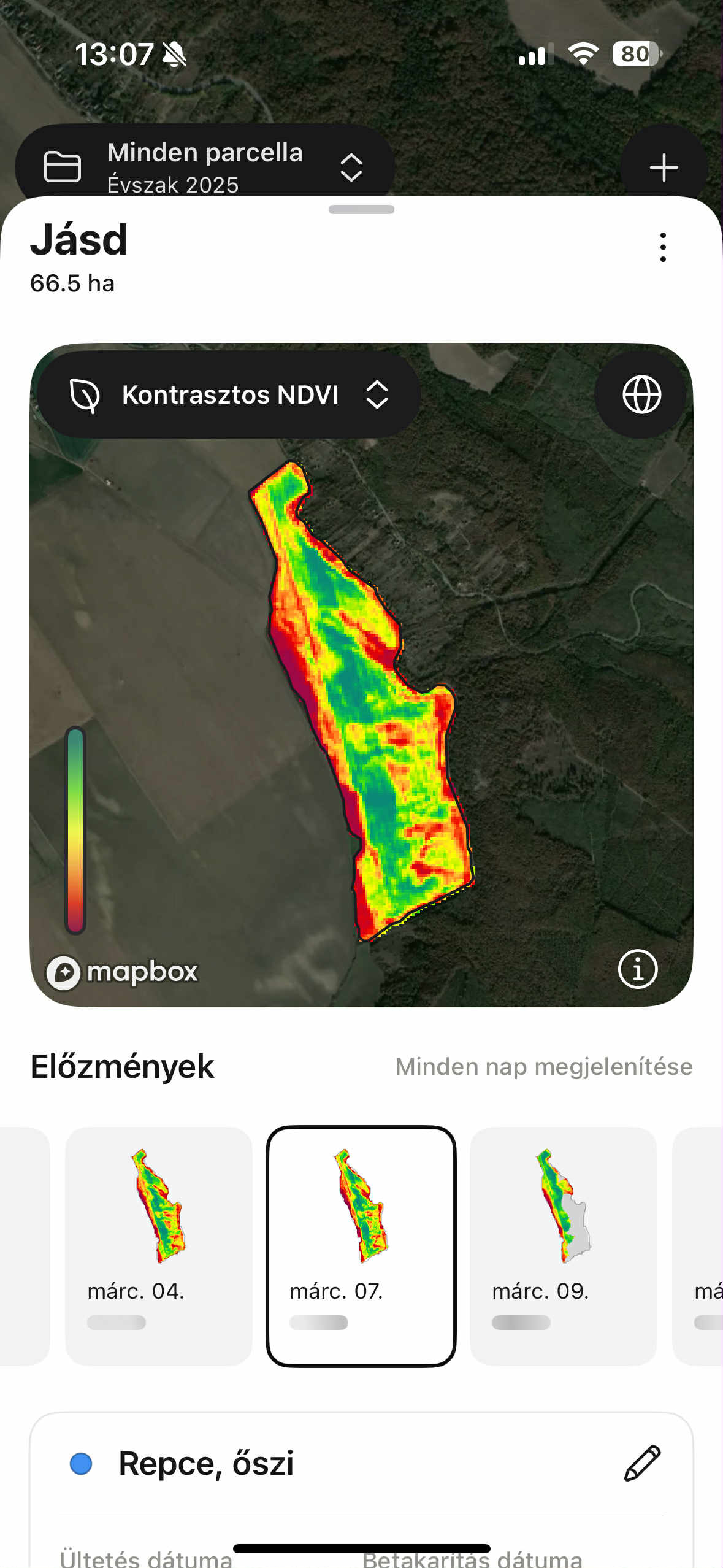
March 7th, 2025 – Oilseed rape
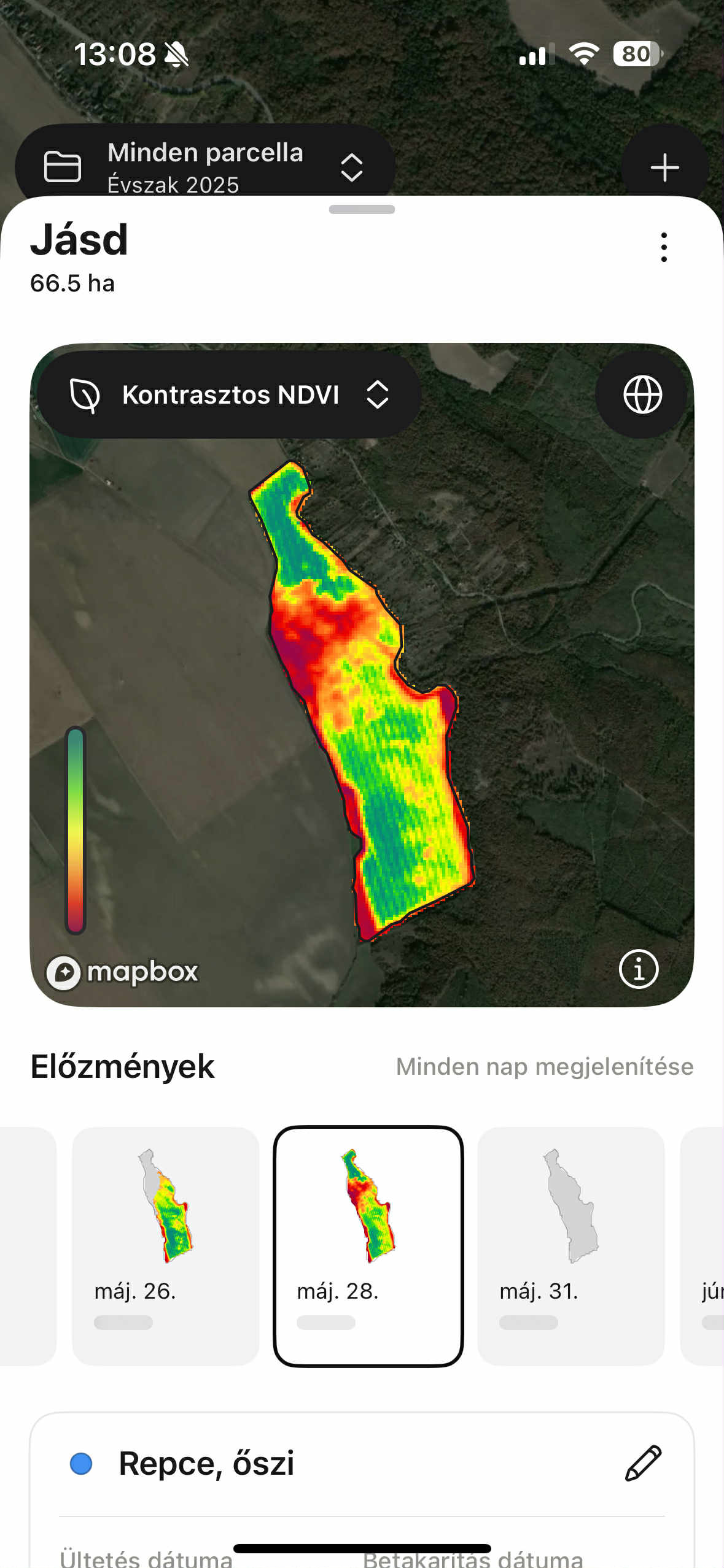
Mai 28th, 2025 – Oilseed rape
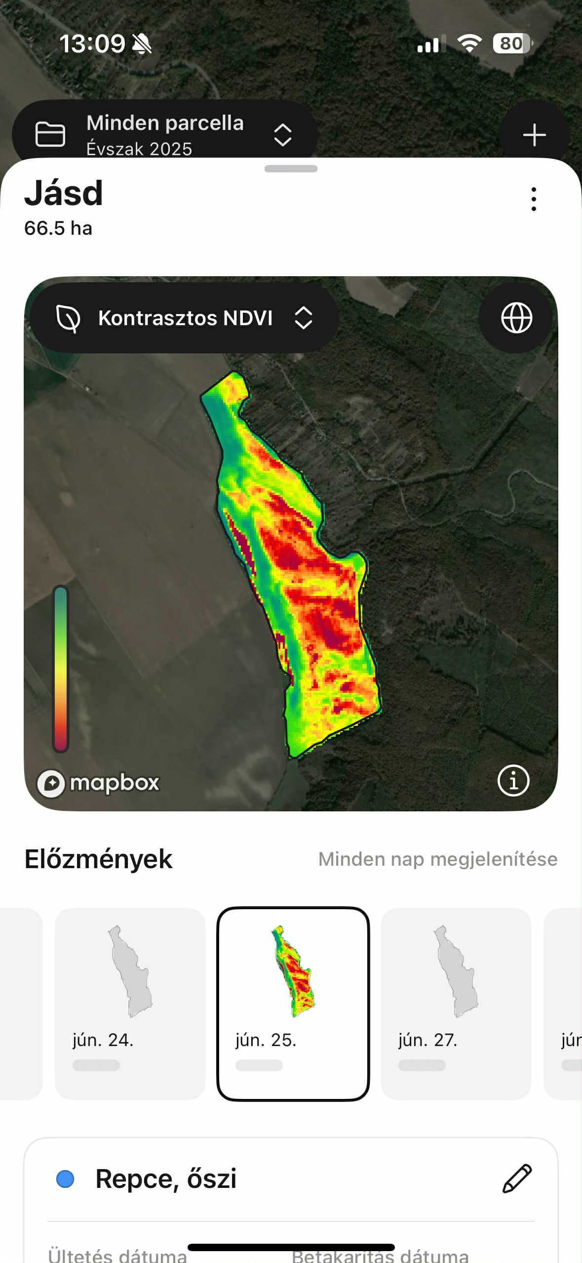
June 25th, 2025 – Oilseed rape
If we do not have enough yield data, we also use NDVI images to create the zones. However, it is very important that we work with images taken during the correct phenophase.
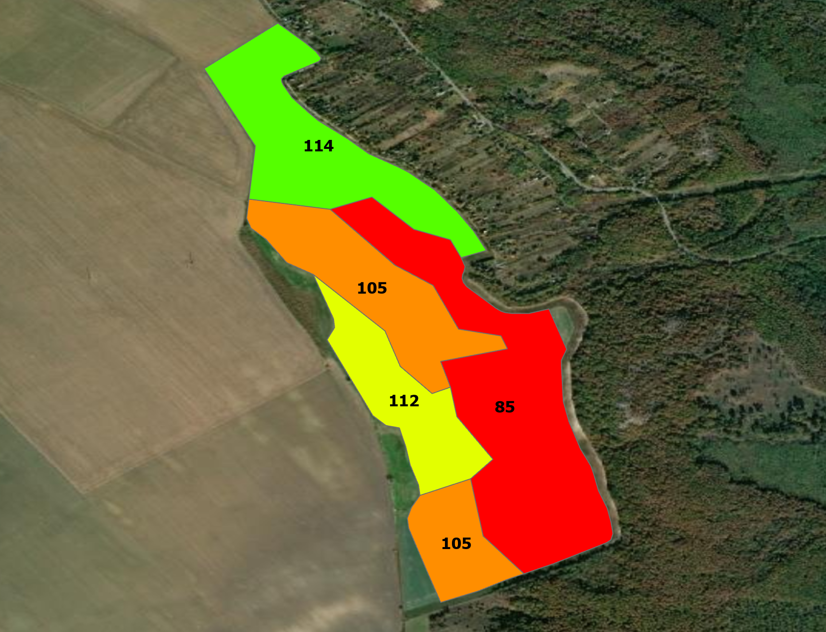
Creating management zones
Using all the yield-, elevation- and another data, we create the management zones -if it is necessary- and determine their relative yield efficiency values based on cell-level yield measurements. These values show the percentage difference of each zone from the field average. The relative yield efficiency values for these zones are based on a three-year average. According to the relative zone performances we are dosing the each zones. There are two ways: persistency yield by using less fertilizer or the same fertilizer as before and increasing yield.
But there is a better way to create management zones. Much better if the machines can manage it.
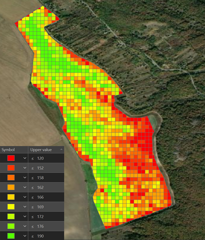
Dedicated dose values for each grid cells
The next level of the precision agriculture is not about management zones. Insted of more accurate to upscaling the planning grid net accordig to the device working width. At this field for 10*10m or 33*33ft to 30*30m or 100*100ft. Each cells have the own dose according its yield performance based on the field and crop unique equatation.
This means that the whole field are under the highest level of control.
Get a Personalized Offer for Your Farm!
Step into the future of farming with innovation and efficiency. Contact us today!

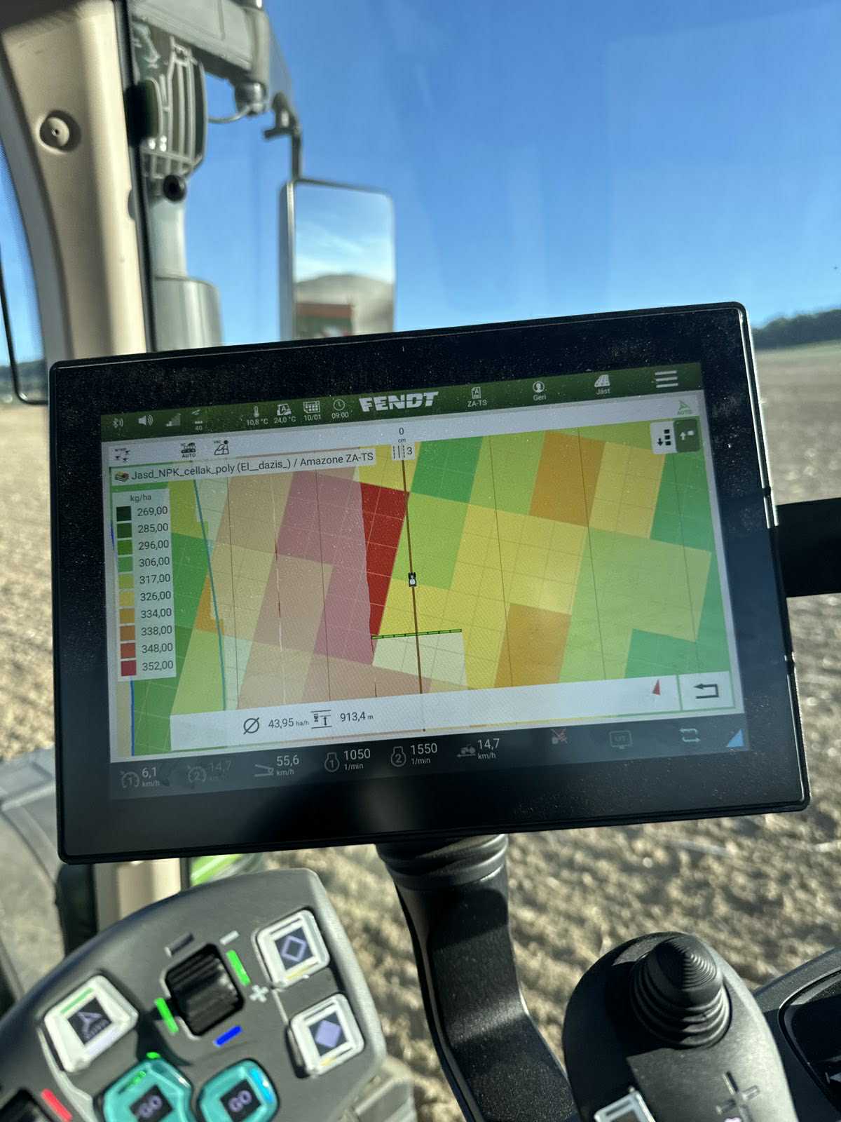
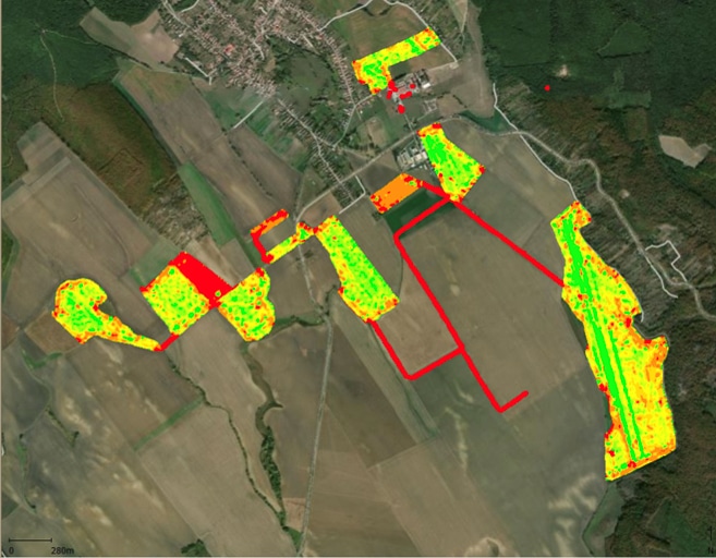
Variable Rate Application map in work
The ready to use VRA map uploaded to the applicator’s monitor during operation.
Variable rate spraying demonstration
We held a variable rate spraying demonstration in Tokod, Hungary.
The video clearly shows the section control, the dose changes, and the operation of the system.
The completed spraying map
Our plan was to apply 9348 liters or 2470 gallons of 30% Nitrosol.
After checking the recorded, cleaned, and interpolated data, we found that a total of 9690 liters or 2560 gallons of fertilizer was actually applied.
This is a difference of 3.5%, which is an acceptable amount and within the margin of error for these measurements.